
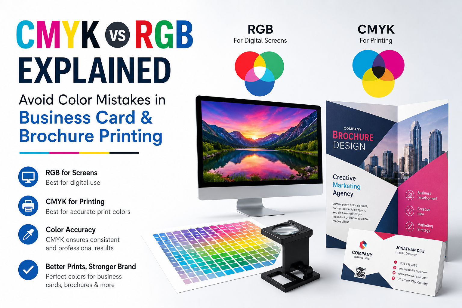
When designing business cards, brochures, flyers, or marketing materials, many people spend hours perfecting the layout, fonts, and images. However, one common mistake can ruin the final result—using the wrong color mode. If you’ve ever noticed that your printed design looks different from what you saw on your computer screen, the reason is usually CMYK vs RGB.
Understanding these two color modes can help you achieve professional-looking prints with accurate colors and avoid expensive reprints.
What is RGB?
RGB stands for Red, Green, and Blue. It is the color mode used by digital devices such as computers, smartphones, tablets, and televisions. RGB creates colors by combining different levels of red, green, and blue light.
Since screens emit light, RGB can display bright, vibrant, and highly saturated colors. This is why your logo or brochure may look more colorful on your monitor than it does after printing.
RGB is ideal for:
- Websites
- Social media graphics
- Mobile applications
- Digital advertisements
- Email newsletters
- Online presentations
If your design is only going to be viewed digitally, RGB is the right choice.
What is CMYK?
CMYK stands for Cyan, Magenta, Yellow, and Key (Black). Unlike RGB, printers use ink instead of light. CMYK combines these four ink colors to produce millions of printable shades.
Professional printing companies use CMYK because it provides consistent and predictable print results across different materials.
CMYK is recommended for:
- Business cards
- Brochures
- Flyers
- Posters
- Packaging
- Catalogs
- Letterheads
- Visiting cards
If your design will be printed, always create or convert it to CMYK before sending it for production.
Why Do Printed Colors Look Different?
Many people design artwork in RGB and send it directly for printing. During the printing process, the design must be converted to CMYK.
Some bright RGB colors simply cannot be reproduced using printing inks. As a result:
- Bright neon greens become dull.
- Electric blues appear darker.
- Vibrant oranges lose intensity.
- Rich reds may look slightly muted.
This color shift is completely normal because screens use light while printers use ink.
Common Color Mistakes to Avoid
Designing Everything in RGB
This is the most common mistake. Always choose CMYK when creating artwork intended for printing.
Ignoring Print Proofs
Always review a digital or physical proof before approving large print orders.
Using Low-Resolution Images
Use high-quality images with at least 300 DPI for sharp printing results.
Choosing Neon Colors
Extremely bright RGB colors cannot be reproduced accurately in CMYK printing.
Forgetting Bleed and Margins
Professional print files should include proper bleed an
Why CMYK Matters for Business Cards and Brochures
Your business card is often the first impression customers receive. If your brand colors appear different from your logo or website, it can affect your professional image.
Similarly, brochures with inaccurate colors may make product photos, branding, and promotional materials look less appealing.
Using CMYK ensures:
- Better color consistency
- Professional-quality printing
- Accurate brand representation
- Reduced printing errors
- Fewer costly reprints
Tips for Perfect Print Color Accuracy
To achieve the best printing results:
- Design in CMYK from the beginning.
- Use professional design software like Adobe Illustrator or Adobe InDesign.
- Keep images at 300 DPI.
- Embed or outline fonts before exporting.
- Save print-ready files as PDF with CMYK settings.
- Work with a trusted professional printing company.
Why Choose Printix Digital?
At Printix Digital, we understand that color accuracy is essential for professional printing. Whether you need premium business cards, brochures, flyers, packaging, stickers, or marketing materials, our advanced printing technology ensures your designs look exactly as intended.
Our experienced team checks every print file for color accuracy, print quality, and production readiness before printing, helping you avoid common printing mistakes and ensuring outstanding results
Final Thoughts
Understanding CMYK vs RGB is one of the simplest ways to improve your print quality. While RGB is perfect for digital screens, CMYK is the industry standard for professional printing. Choosing the correct color mode before printing helps maintain brand consistency, saves money, and delivers vibrant, high-quality business cards and brochures.
If you’re planning your next printing project, preparing your artwork in CMYK will ensure your final product looks professional, polished, and exactly the way you envisioned