
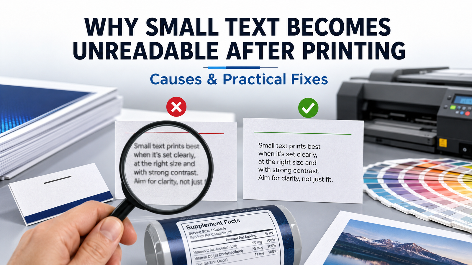
Small text may look perfectly clear on a computer screen but become blurry, broken or difficult to read after printing. This common printing problem can affect business cards, product labels, stickers, brochures and packaging. Understanding why small text becomes unreadable after printing can help you prepare a better design and avoid expensive reprints.
Why Does Small Text Become Unreadable?
1. The Font Size Is Too Small
Every printing method has practical limitations. Text below 6 points may lose clarity, especially when printed on textured paper or using special finishes. For most printed materials, body text should be at least 8 points. Important contact details should ideally be 9–10 points for comfortable reading.
2. The Typeface Is Too Thin
Light, narrow and decorative fonts may appear elegant on screen, but their fine strokes can disappear during printing. This problem becomes more noticeable with white text on a dark background. Choose a medium or semi-bold font when the text is small. Clean fonts such as Arial, Helvetica, Roboto and Open Sans generally produce better results.
3. Poor Colour Contrast
Small grey text on a white background or light text over a busy image can be difficult to read. Use strong contrast, such as black text on white or white text on a dark solid background. Avoid placing essential information over patterns, gradients or detailed photographs.
4. Low-Resolution Artwork
A low-resolution JPG or screenshot may make letters look pixelated when printed. Prepare your artwork at 300 DPI at the final printing size. Vector files such as PDF, AI, EPS or SVG are usually better for logos and text because they retain sharpness when resized.
5. Incorrect Colour Registration
Text created using multiple CMYK colours can develop coloured edges if the printing plates do not align perfectly. For very small black text, use 100% black instead of combining cyan, magenta, yellow and black. This helps produce cleaner and sharper characters.
How to Keep Small Text Clear in Print
Before sending your design for printing, check it at its actual size rather than judging it only while zoomed in. Print a test copy on a regular printer and ask someone else to read the smallest information.
Maintain sufficient spacing between letters and lines. Convert fonts to outlines or embed them in the final PDF so the printer receives the correct typeface. Always export the design using a print-quality PDF setting and include bleed where required.
If your design contains foil, embossing, Spot UV or printing on textured material, avoid extremely small or thin text. These finishes need thicker strokes and additional spacing to remain clear.
Final Thoughts
Readable text is essential for professional printing. The right font size, strong contrast, suitable typeface and high-resolution artwork can prevent most clarity problems. Before ordering business cards, labels, stickers or packaging, request a digital or physical proof. A careful pre-print check protects your budget and ensures customers can easily read every important detail.